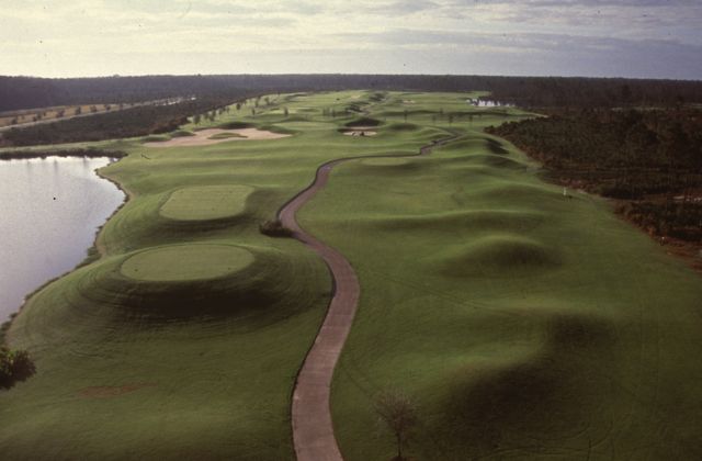
The Champions Course at LPGA International is Rees Jones at his stereotypical worst with all the repeated perimeter bubble humps and cartoonish bunkers. The uniformly round and oval greens look like they were designed by computers programmed to calculate perfectly spaced 1 through 5 pin positions separated by shelves and tiers. The entire site is flat and rotten with swamps, the holes are too spread apart, it’s always hot and its mama has bad breath.
Okay, I feel better. It’s not quite that bad, but there’s nothing here that feels very inspired, natural or intuitive. If you’ve got to say something nice, the fairways are spacious, perhaps a nod to the prodigious lanes at Daytona National Speedway about a mile away. Then again, there’s more payoff to hugging the curves there than there is to utilizing the wide berths at Champions, though in both places if you get a little too wild you’ll be bouncing of the bumpers.
That’s a shame. With all this space to utilize there could be all kinds of interesting features and hole shapes. Instead, it’s all straight ahead down the lane into a green cut by a tier. You feel like you’re playing the same hole over and over. The whole thing is underwhelming and formulaic. Damn computers. (83)
LPGA International—Champions Course
Daytona Beach
Architect: Rees Jones
Year: 1994

